Instagram paper typography star, Sabeena Karnik, takes quilling across the world

Sabeena Karnik

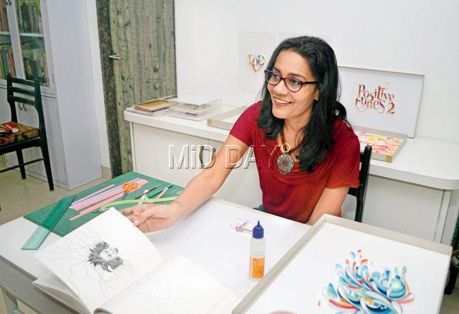
Sabeena Karnik. Pic/Sneha Kharabe
ADVERTISEMENT
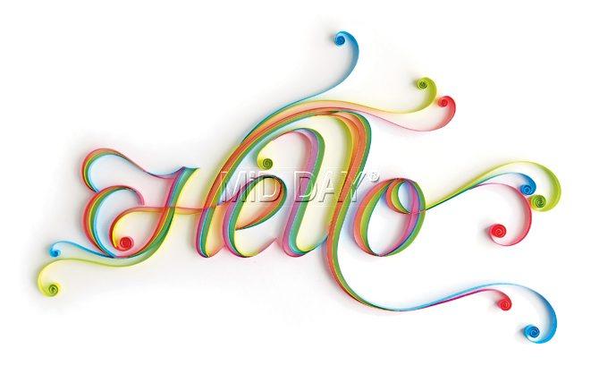
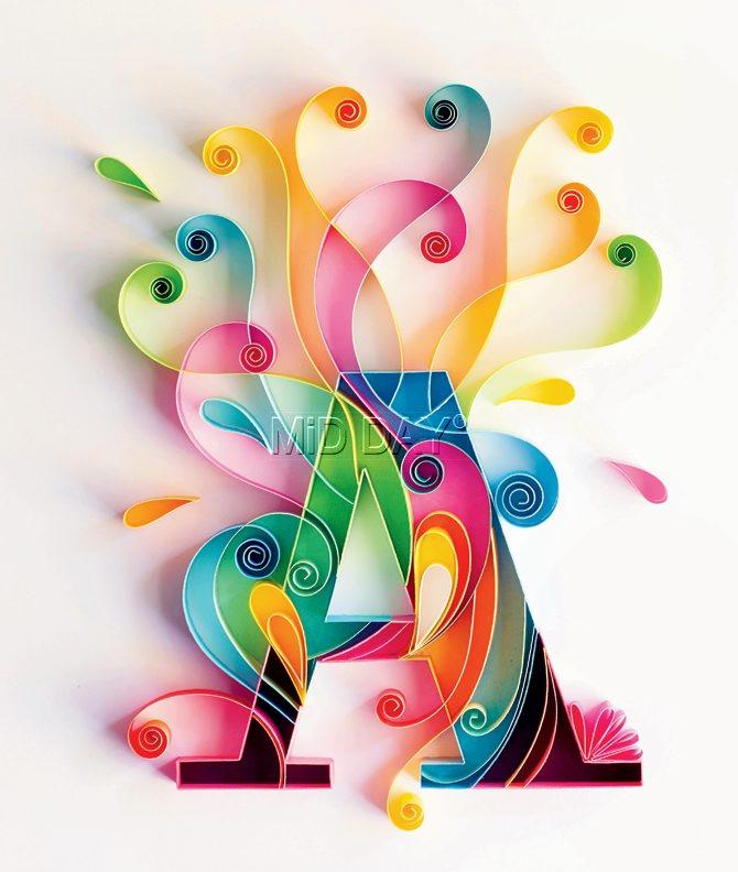
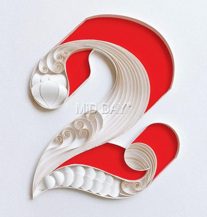
When Sabeena Karnik first began posting her alphabet series on Instagram, she didn't know that she had stumbled upon a whole new world. "I started with the letter 'A' but it wasn't until I reached 'F' that I got my first assignment," she says, her voice falling on us serenely. That was back in 2012 on Behance; now, if you are one among the 78,000+ followers of @sabeenu on Instagram, you'll know these letters that Karnik creates through quilling. With gentle curls that remind you of Disney princesses or swirls that spiral tighter than the best pinwheel cakes, Karnik's creations are elaborate yet detailed.

At her Chembur home, in which a room with a modest sunlit balcony doubles up as her studio, Karnik quietly twirls strips of paper around the end of an ordinary painting brush. "I got to know of quilling equipment, like this needle here, only recently," says the 34-year-old, who sports a wrist tattoo that reads, "You're my type". Her work station is as basic as it gets - strips of paper, the white base, Fevicol and a brush - and beguiling of the effort that goes into making every piece. Crafting a single letter can take her anywhere between a couple of hours to four. From this frugal but efficient room, Karnik ships her flamboyant creations to clients across the world. Take Instagram, for instance, who, at their San Francisco headquarters have Karnik's creations on display. In 2014, the Karnataka Tourism Department sought her out to create the grand Mysore Palace with sunset hued paper strips - an assignment that needed 60 hours of work.

A graduate in graphic design from Sophia Polytechnic, Karnik is among the few typographers in the country who create handmade fonts and lettering rather than digital ones. "Paper is a tricky medium to work with it. It will curl easily and also refuse to cooperate. You have to learn how to control it - when to tighten it and when to let it loose. That way, quilling is a lot like watercolour," says Karnik, as she shows us an assortment of paper stocked in her cupboard. Her go-to places for sourcing material are Bora Bazaar and Abdul Rahman Street in Crawford Market. While she chooses to cut her own paper instead of buying readymade quilling strips, her favourite part is the white base made usually from Cordenons paper, an Italian make. "I can only compare it to velvet. I love seeing the reflection of the coloured paper on the base," she says. Speaking of reflections, Karnik shows us a book cover that she has designed, for Time and Time again, a soon-to-release novel by bestselling American author, Tamara Ireland Stone. "Quilling forms tend to be very feminine - with curves and swirls. However, with this love story set across two cities and two different times, I had to achieve a balance of femininity and masculinity," explains Karnik.

The everydayness of paper - the fact that it seems like a non-intimidating medium - works wonders, but can also work against her. "Indian clients tend to go, 'Oh, it's just paper'. Paper doesn't get accepted easily." And, then, she has to compete with hobbyists, for quilling is a popular pastime that makes its way to greeting cards and paper jewellery. Karnik has met many a parent who proudly shares that his daughter is equally good with quilling. "And the daughter they refer to is just three!" she laughs.
 Subscribe today by clicking the link and stay updated with the latest news!" Click here!


