Gradually, children’s books on India’s history and mythology are warming up to quirky palettes, vivid illustrations and vibrant storyboards. Two illustrators and an editor take us through this emerging trend
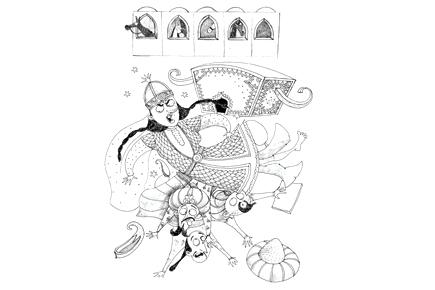
A scene depicting Raziya falling down, extracted from the book Raziya and the Pesky Presents by Natasha Sharma
 Q. How did you get roped into to illustrate for Razia and The Pesky Presents?
A. I’ve illustrated books for Duckbill previously, and books Natasha had written with other publishers. So, I knew I could be assured of a really fun book to illustrate considering what a good combination Duckbill and Natasha would make. I was sent the first draft to read and it was hilarious. I love making irreverent illustrations and there was immense potential for that in this title.
ADVERTISEMENT
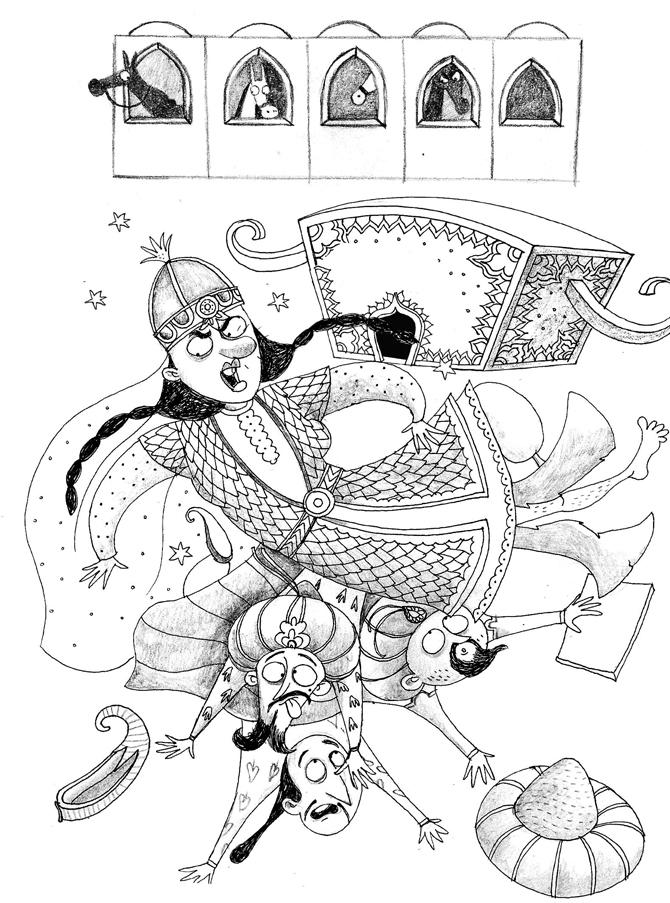
A scene depicting Raziya falling down, extracted from the book Raziya and the Pesky Presents by Natasha Sharma.
ART/priya kuriyan
Q. What were some of the immediate challenges you faced when you began work on this?
A. Well, the biggest challenge was that there wasn’t much existing visual documentation available in terms of what she actually looked like, what her palace looked like or what exactly she wore. So, a lot of that had to just be imagined. But the fun part of it is that it lets you take artistic liberties that one could not have otherwise.

Looking for suspects
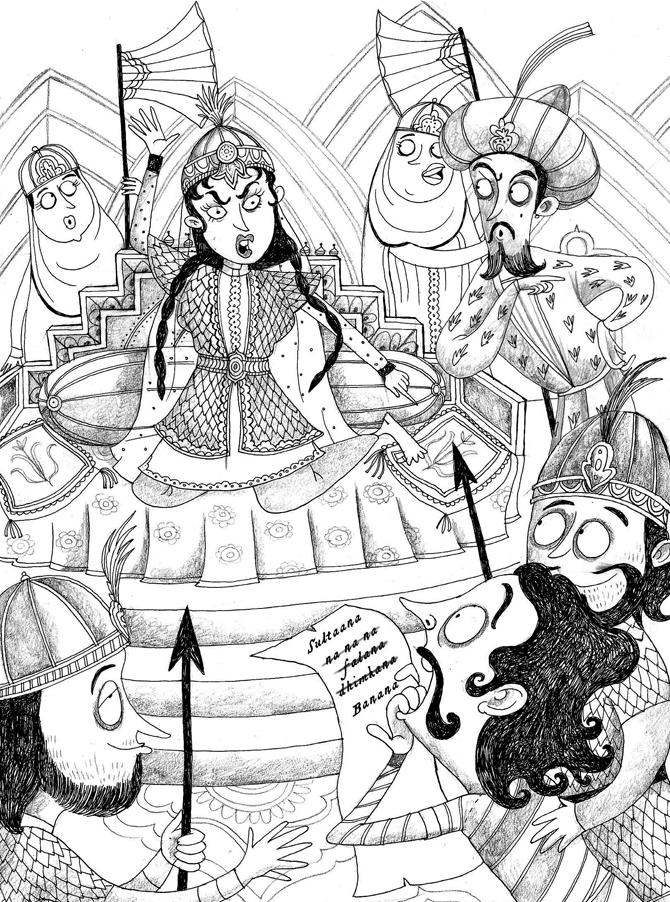
Poetry reading session
Q. Since it was a historic-themed book, did you have to alter your basic style?
A. Not really. On the contrary, I often feel the influence of the miniature paintings in my work. So, in some way, that kind of fit in very neatly with this book.
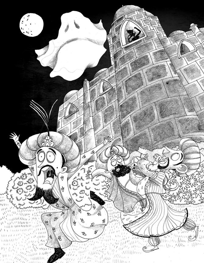
The fear of the ghost. Art/Priya Kuriyan
Q. Have illustrations for Indian children’s writing taken a leap of faith with experimentation, ideas and bolder colour palates?
A. Yes, I think publishers and editors have begun seeing the potential of well-illustrated books. I think more publishers are looking at illustrations, not just a value addition, but as an integral part of the book. Also, illustrators are getting a lot more recognition for the work they do now, as compared to 10-15 years ago. There is still a long way to go, though. A lot more experimentation in terms of book formats/printing techniques and so on, is possible if the economics of it weren’t so tricky.
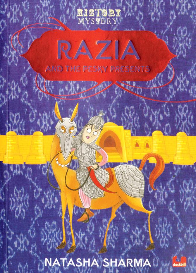
Razia And The Pesky Presents, Natasha Sharma, Duckbill, Rs 175.
 Q. What were the points that you had to consider, keeping in mind that you were dealing with India’s most famous epic?
A. The first thing in my mind while working on this book was to keep things very simple. Because I knew communicating The Gita to kids wouldn’t be easy if I don’t make things the way kids would find appealing. I want every young reader to come and flip through the pages of the book and understand that this book is made for them. I had spent a long time on getting the style right. But everything will pay off if kids love it.
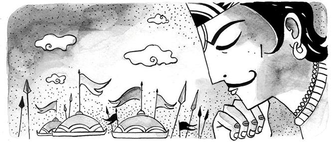
Bewildered Arjuna; a scene from chapter 1
Q. How crucial was the style while working on this particular title?
A. The idea of having a bright and vibrant cover was must for this particular book. I have used Krishna and Arjuna on the cover, but in a more contemporary way. The usage of vibrant colours, simpler forms and bold patterns make the cover look more attractive.
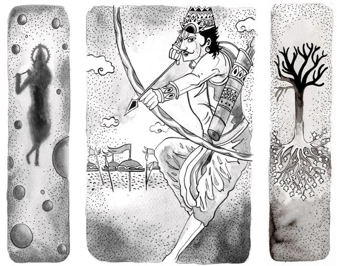
Panel from chapter 9; (centre) Arjuna at war; (left) panel from chapter 15
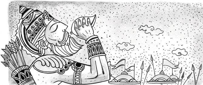
I wanted the kids to look at the book from a distance and grab it. The illustrations inside are simple and are in monochrome, even though some of them depict complex ideas.
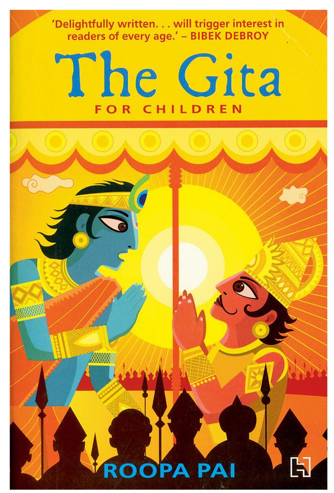
The Gita for Children, Roopa Pai, Hachette, Rs 299. ART/SAYAN MUKHERJEE
The figures and expressions are line drawings mostly, with basic wash of shadows. This might look simple, but again we spent some time to get it right. Overall, it came out nice and the style also blends in well with the text.
 Subscribe today by clicking the link and stay updated with the latest news!" Click here!


