Washroom signs across city bars are less ordinary and more confounding. Read on to avoid walking into the wrong door
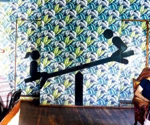
The bathroom signs at Versova Social show a girl and a boy on a see-saw. Pic/Nimesh Dave
If you've been standing confounded in front of washroom doors at restaurants, wondering which one to open, well, join the club. Bathroom signs have taken a turn from the ordinary to the amusing and confusing.
ADVERTISEMENT
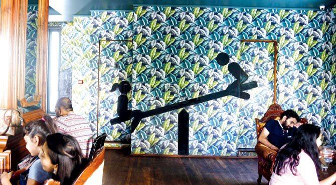
The bathroom signs at Versova Social show a girl and a boy on a see-saw. Pic/Nimesh Dave
But that's the point, designers tell us. It's not just about the food or the drinks anymore, but about making the toilet a talking point. And, if you do walk into a bathroom not meant for you, well, you always have a funny story to tell at the next party.
Raasta, Khar West
Last week, when we popped into Raasta on a Thursday night, we saw reggae lovers strut their stuff on the dance floor. They had their dreads in place, net T-shirts, short shorts and dark eyes. The bathroom signs don't look very different, keeping with the Jamaican Rastafari theme.
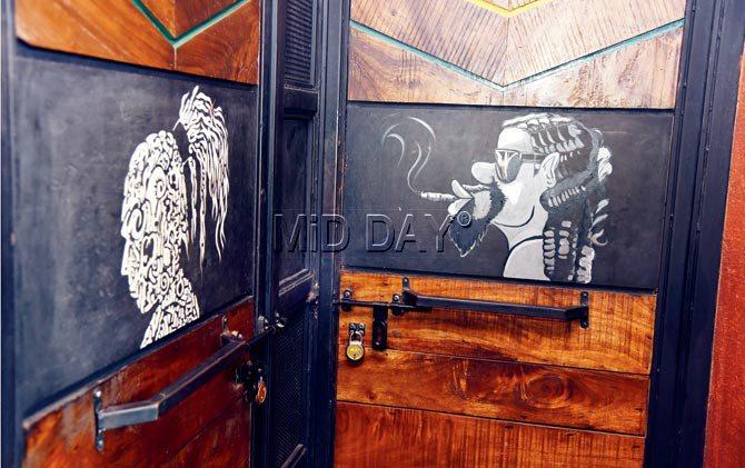
The signs show Jamaicans with dreadlocks. Pic/Datta Kumbhar
"The whole Raasta style is very laidback, clean and pure. If you see the door, the guy is smoking a doobie (joint), and the girl's head doesn't look very different, as they both have long dreads tied in a ponytail," says Kyle Lillywhite, brand and marketing manager. "We have had many tipsy girls who don't know who is the girl on the doors, and have wandered into the men's loo."
Salt Water Café, Bandra West
The at-first confusing, and then oh-so-blatantly-obvious knob and hole on the doors of the washrooms at Salt Water Café have left many perturbed. But, Ayaz Basrai of The Busride says that they never thought of the sexual connotation when they first designed it.
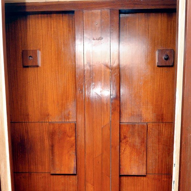
Pic/Datta Kumbhar
"We actually wanted it to be similar to the Smoke House Grill in Delhi, which has a piece of bark with a hole, and a knob," he says. "We actually thought of it as minimalism, and just wanted to use the basics. Is it confusing? We think it's pretty simple."
Social, BKC and Versova
Hanif Kureshi of St+art India Foundation, that's behind the washrooms at Capital Social and Versova Socials, remembers the bathrooms he saw in Berlin. "Every washroom was a piece of art that you walked into. People are encouraged to write graffiti on the wall, and draw or sketch. So, it's like layers and layers of art and graffiti, and it's beautiful," he says.
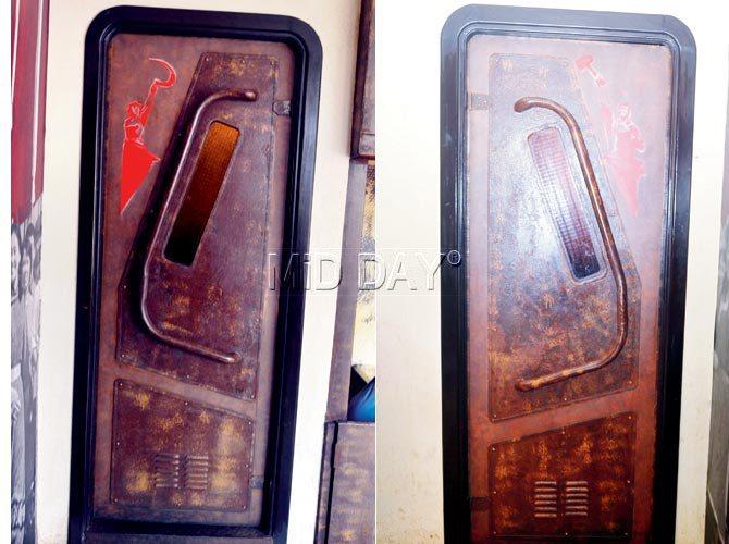
At BKC's Capital Social, the theme for the washroom signs is Communist. Pic/Datta Kumbhar
His design for Versova Social is a girl and a boy on a see-saw embedded into a green wall of leaves, and it needs to be seen from afar to figure out which side has the door you need to open. "The difference is subtle; just one ponytail," he says. At Capital Social, the theme is Communist, with a man and a woman holding a sickle. But, to us, it just looks all the same. "The point there was to have a Communist hangout in the middle of all that surrounds us."
Xico, Lower Parel
The zig zag Aztec sign at the newly opened Mexican restaurant, at Kamala Mills' Xico, is a deliberate attempt to confuse you, says designer Shabnam Gupta of The Orange Lane. The firm behind the decor of The Bar Stock Exchange wants you to know that washrooms are more than just about going to the loo.
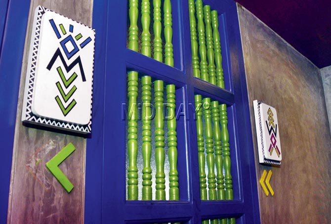
The zig zag Aztec sign at Zico. Pics/Sneha Kharabe
"The whole décor is Aztec. If you look closely, it's a W for women, and an inverted W which becomes M for men. Because of the multiple zig zig lines, you are sure to get confused. And if you are tipsy, then yes, it will be tough," says Gupta. To us, the design looked like a spider, who went crazy in a riot of colours. Gupta says it's about smiling over what happened when you went to the loo. "A bathroom sign should initiate a 'check this out' kind of reaction," she says.
And it gets curiouser, Della Adventures, Lonavala
Della seems to have really pushed the envelope when it comes to bathrooms, and almost makes a woman believe she could have walked in on a man doing his business, with a man with his back towards them. This is, in fact, a mannequin. The men's washroom has a generous use of glass, and the impression of a catwalk ramp with female mannequins who watch you as you use the bathroom.
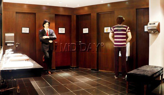
Architect Jimmy Mistry, Principal Designer & Owner of Della Group, says, "Washrooms tend to evoke different emotions in people. While customer expectations might be conservative or even indifferent in case of public washrooms, here at Della, we explore the fun element. The washrooms are far from prosaic and are, in fact, naughty, without being over-the-top, or crude. They get the shock value right."
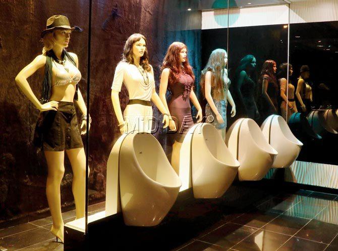
Reactions at Della have gone from people being amused to taking pictures with the mannequins. "In fact, customers take home the hair pieces on the mannequins as souvenirs. We've lost so many of them that finally we had to stop putting a wig on them."
 Subscribe today by clicking the link and stay updated with the latest news!" Click here!


