Make your bedroom appear bigger with these hacks
Updated On: 04 December, 2022 05:27 PM IST | New Delhi | IANS
City homes usually come with small bedrooms but with the right technique, even a clustered room can fool one's eyes to appear bigger

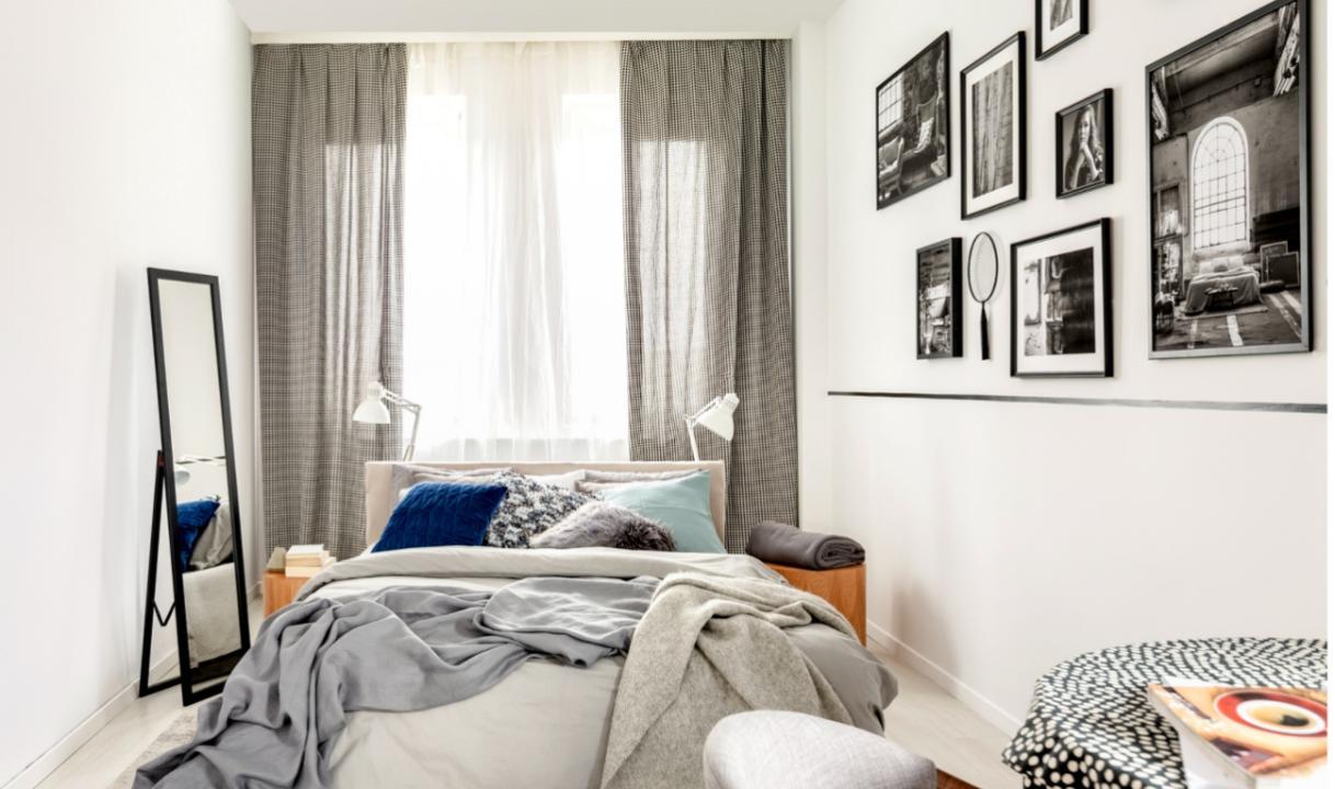
Image for representational purpose only. Photo courtesy: istock
City homes usually come with small bedrooms and may seem more like a cave than a cozy refuge. However, with the right technique, even a smaller room can fool one's eyes to appear bigger than it is. A subtle mix of illusions from the gestalt theories and a thoughtful composition of the mood board can transform a small bedroom to give out a feeling of a larger space.
Every space is perceived in parts that fit into a whole — A blank canvas breaks a space and articulates it in multiple directions, throwing better, individual focus on the elements in the foreground. Go minimal on the backgrounds with compact furniture and statement decor. Cut down the layers of interior accessories such as throw pillows, valence curtains, tapestries, etc., and compose a more sleek aesthetic with solid textures and pristine metal accents. You can bring in more low-rise pieces like platform beds, wing chairs, linear consoles, and ottomans to bring out good visual connectivity and let the space breathe.
Go for lighter colour palettes
All warm whites, cool whites, neutral beiges, and pastels take over the character of white -- its bare face and reflectivity. Spaces ruled by these white-based, light-hued colours like taupe, peach, powder blue, blush pink, and more tend to reflect light to make their expanse bifold. Bring these sophisticated light tones in everything from the bed to the headboard and bounce off the light with more polished finishes and smooth textures on the surfaces. Terrazzo walls, marble floors, and crystal chandeliers have created a wave in the all-white bedroom trends -- you can bring such monochrome effects with colour co-ordinated floors and walls to get an extended view of the space.
Blur the boundaries
Breaking into the physical boundaries of space make it feel less defined -- and hence, bigger in appearance. Throw more focus on the openings like windows, balconies, or sit-outs and include them as a part of the space. Introduce furniture pieces that connect the spaces with a single theme -- include nature-inspired palettes like wooden cots, rattan chairs, log tables, bamboo shades, handcrafted lamps, and more to achieve a true al fresco interior.
On the other hand, solid walls can also blur spatial boundaries with reflective panels or decorative mirror accents that draw an illusion of a larger space. You can also scale up the mirror images with signature floor mirrors or dedicated mirror walls that introduce newer views into the space.
Vouch for built-in pieces
Well-planned furnishings demarcate space and define its expanse. Introducing built-in furniture along a clean-lined layout can give a neat outline to the visual composition of the interior. Either the clearance can be nullified completely with a floor-to-ceiling wardrobe or the setup can be much airier with floating cabinets. Go for petite silhouettes and monochrome palettes for custom storage and experiment with space-saving upgrades like convertible tables, under-bed storage, etc. More concealed elements can also be brought in with cove lights along the wall panels, among others.
Balance the proportions
Creating the illusion of a larger space is entwined with the composition of the elements -- the visual balance and the rhythm. Symmetric elements like a pair of pendant lights, a 4-door console, a 2-door French window, and more, signal a direct balance while the details like geometric wallpapers take it beyond the immediate sight. Compositions like grid gallery walls, twin vanity, or even identical decor can elongate your viewpoints and make the space feel larger.
In parallel, the relationship between continuity and illusion is best illustrated by ceiling-to-floor drapes and sheers spanning along an entire wall, carpets taking over an entire floor, and more that connect different parts of a space and draw a cohesive interior scene. These connecting elements are the key to the visual impressions of space on the onlooker.


