Engineers think analytically, believe in scientific laws, and live discipline. Architects feel intuitively, believe in questioning all laws and live creativity.

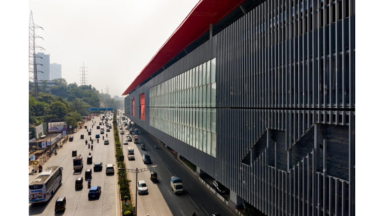
Representational Image
The tussle between engineers and architects is one that has seen no end. Metro projects are classic examples where engineers call the shots, head decisions, and direct construction. Unlike most of our architectural commissions where we hire engineers to extend our possibilities for various disciplines of civil, structure, electrical, mechanical etc; here the engineers define our scope, broadly limiting it to superficial form and color, as mere aesthetic advisors. It surely is a completely different experience, a different world, and a different reality.
ADVERTISEMENT
It’s exciting to see a lot of methods and no madness in the project life. and there is almost no room for disruption of any sorts, read, rethinking, and reinventing are not appreciated, forget being accepted. My argument in this extreme exaggeration is that this typology of architecture is self-cleansing. Unless your design idea is strong and clear, it stands no chance. Unless it solves some clear issues and makes some paradigm shifts in the protocols, it heeds no interest.
Therefore it is an apt opportunity to explore and express the power of design instead of the usual expectation of mere decoration. The position of architect and architecture stands a great chance, as long as it can make relevant and realistic arguments.
'Let the architect decide the flooring pattern' was an initial attitude to our role that eventually got translated into 'do conceptualize the complex composition of these junctions’. Proposing and vetting every drawing being dished out for the construction of the station finally was a victory of sorts; a trajectory most cherished. This has been our three-year journey so far on the forty-odd stations for Mumbai across the first four lines of the city’s scheme.
Studio archohm started with picking every pain point in the experience and the image of a station in this insanely dense and tight metropolitan morphology. Thereafter we systematically addressed each one of these issues with clean and clear architectural solutions. We spoke the engineering language; of speed and solutions. The final design walked the path of simplicity and rhythm to ensure smooth execution and perhaps less effort, and thereby less resistance. Our product had to be tested. at an urban level and at an architectural level; and to keep things minimal was a defining choice.
One had to respond to the chaos and clutter of Mumbai’s contradicting coexistence; the spread of slums and tall towers. We responded with restraint. The statement was to not make one; and definitely not with every one of them. This would have only added to the clutter of one upmanship that had already taken away any semblance of order, from the acutely ambitious city. The idea was to conceive an avant-garde system, a kit of parts that can adapt and still keep its identity intact. Another issue was to keep the longevity of the aesthetic at the city level while being specific to the site and context at the local level. The access points, the spaces, the entries, the art, and the graphics would transform each seemingly similar space into a powerful place for commuters from inside and the citizens from outside the station.
The stations just like the commuters are a collage of ideas, translated into design elements ;
- Vertical louvered frames that make the station an illusion of an opaque and dynamic box.
- The vertical lines make for maximum rain and sun protection.
- The rhythm of lines gives a transparent inside-out experience of views and ventilation.
- The large open roof, detached from the structure, floats in the seaside city.
- The corresponding color of the metro line, orients the city with its commute system.
- The pickup points to the stations become points of intervention and an opportunity to reorganize the urban detail.
- The monolith interiors, with minimal materials, keep the ‘building’ in the background of its commuters.
- The color blocks of stairs and escalators are optical guidance and navigation for vertical movement as one maneuvers inside.
- The zero-paint station ensures life long maintenance.
- Almost no horizontal surfaces ensure prevention of dust collection and bird droppings.
- A single tone of granite as a material has been explored for all public areas. varied textures have been specified to ensure functionality and character.
- All services, lights, and pipes have been carefully concealed yet kept serviceable.
- Controlled use of glass and aluminum has been done to withstand the sea salt and rains.
- The colour monologues on the long facades are in rhythmic dialogue with trains inside.
Last but not least, the metro columns and the viaducts that span the entire Mumbai are marked with a crisp color line that punctuates but does not pollute the visual experience of the Mumbai Megacity.
The article is written By Sourabh Gupta Principal Architect & Managing Director Studio Archohm
 Subscribe today by clicking the link and stay updated with the latest news!" Click here!


