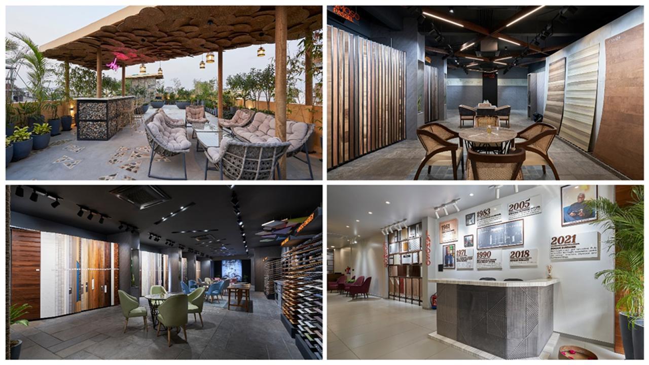
In the era of online shopping, creating a retail environment for the people who will want to visit the store is the key. More importantly, the space needs to reinforce the brand message and create an experience, not just a shopping opportunity.
ADVERTISEMENT
The concept of Somani Surfaces was to treat the showroom like a contemporary gallery and not a typical veneer showroom. They have created a space that is exceptional in design and that speaks directly with the contemporary stylish display of the Somani’s products. It’s a three-storey building, of which the ground floor is occupied by the reception area, master cabin, staff workstation and conference room. The rest of the two floors are decorated with display units.
The unique geometry and lights used in the design of the facade allow the project to stand out as distinct. The dry cladding of the laminam porcelain slab for the structure is formed of hundreds of triangular panels that fold and flow across the surface of the facade forming complex geometric patterns that visually break up the flat planes to create an uneven sculptured surface. An integrated lighting design produces a spectacle for passers in the nighttime.
As you enter the showroom, the historical story of the successful journey of Somani's business enriches the wall forming the backdrop of the modern reception table giving warm welcome to the visitors.
A blend of glass and wooden panels screens the master cabin distinct. As one enters the master cabin, the master table in wood and metal stands boldly with the illuminating art piece enlightening the space. The pastel-coloured sofa acts as an informal seating adding charm to the master cabin and rejuvenating the entire space.
Keeping in mind the Shashaank Somani’s faith in Khatu Shyam Baba and his belief that work is worship, the informative wall behind the staff workstation gives a visual display of the story of Shyam Baba making the wall aesthetically good and the holistic blend adds a touch of divinity. The staircase leading upstairs is cast in iron and is clad in wood with veneer in a wavy flow that adds harmony while you stay up.
Designing style of the upper 2 floors of this project is simple and graceful. The layout of the interior space is functional as well as meaningful. The choices of flooring textures, light fixtures, green pots and very well design details of display units create a harmonious walk for visitors while selecting the material. The selection area also has a chilling room for the customers when the selection gets tiresome.
Creating a rooftop deck which is a great way to make use of space that would otherwise be wasted and creates a special place that takes advantage of the views of plenty of plants various levels of sitting and hidden lighting. To create a quiet escape from busy city living, a space to entertain and relax.
Today the showroom has also become the place for the exchange of professional experiences artistic initiatives, new trends and innovations bringing together the professional community of Designers and Architects.
 Subscribe today by clicking the link and stay updated with the latest news!" Click here!


