Home / Mumbai-guide / Things To Do / Article /
Reading loud and clear
Updated On: 27 November, 2021 08:27 AM IST | Mumbai | Sammohinee Ghosh
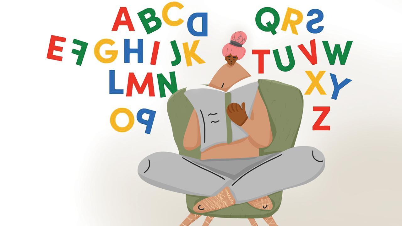
After a dyslexic person invented a new font to help herself, its developers and city-based experts tell us if lettering can affect comprehension and memory

Egio’s font is designed as a stepping stone into an inclusive world of print
Pay heed to typography,” a professor told his postgraduate student. We hear her lowercase ‘c’ wasn’t spaced well away from her lowercase ‘l’. But what could have possibly gone wrong? “Clog” was read as “dog” and we aren’t sure if “click” was one of the subheads in her dissertation. A similar font fail was once overlooked by French luxury company Chanel. The brand released a slew of posters signed off with the phrase, “I love Coco”. It was all good had the stem of the lowercase ‘c’ merging with the lowercase o (and the latter not fully closing off) not looked like a ‘w’. It effectively read: I love Cow.
Typography necessitates care. If Coco reads as Cow to a non-dyslexic person, imagine the pressures of a dyslexic mind. As we sit with the written word, our brain searches for visual stimuli to be able to comprehend. Typography is especially critical in rendering texts legible and comprehensible.


