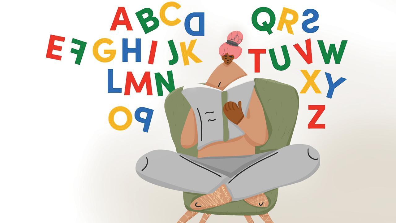
After a dyslexic person invented a new font to help herself, its developers and city-based experts tell us if lettering can affect comprehension and memory

Egio’s font is designed as a stepping stone into an inclusive world of print
Pay heed to typography,” a professor told his postgraduate student. We hear her lowercase ‘c’ wasn’t spaced well away from her lowercase ‘l’. But what could have possibly gone wrong? “Clog” was read as “dog” and we aren’t sure if “click” was one of the subheads in her dissertation. A similar font fail was once overlooked by French luxury company Chanel. The brand released a slew of posters signed off with the phrase, “I love Coco”. It was all good had the stem of the lowercase ‘c’ merging with the lowercase o (and the latter not fully closing off) not looked like a ‘w’. It effectively read: I love Cow.
ADVERTISEMENT
Typography necessitates care. If Coco reads as Cow to a non-dyslexic person, imagine the pressures of a dyslexic mind. As we sit with the written word, our brain searches for visual stimuli to be able to comprehend. Typography is especially critical in rendering texts legible and comprehensible.
 Rocio Egio, Pranav Bhardwaj and Aishwarya Mankar
Find a super power
The Dyslexic Font is a representation of how Switzerland-based Spanish designer Rocio Egio sees words and messages. When she came to know of her dyslexia at 21, things started making sense. “I find it easier to interpret visual languages than written ones. I constantly translate words or ideas into graphic language to process complexities that surround us. Everything seems better with colours, shapes and composition,” Egio shares. She adds, in that moment, dyslexia did become her super power. The designer doesn’t forget to underline that the font is only an example from her own experience. About the positive feedback that’s been flowing in, she says, “The font was born on October 8, International Dyslexia Day. Pranav [Bhardwaj, a designer] reached out to me on Instagram; we collaborated and he brought my interpretation to life. It makes me happy to connect with so many who see the world the way I do.” Egio hopes her conception helps “amigos” to embrace their secret powers.
Sound letters
The need for functionality drew Gurugram-based designer Bhardwaj in. One can’t miss how wacky and fun the colours look. Bhardwaj says, “We went with the original colours used by Rocio. The palette is arranged around peppy and cheerful vibes. I wanted the font to be purposeful. So, we made it available for free on her website.” He believes such concepts make for the stepping-stone to an inclusive world of print. Stressing that the typeface is not a solution for myriad reading struggles, he adds that visual representation is key.
When we reached out to Diya Basu, senior psychologist, Maharashtra Dyslexia Association, she welcomed the news but put the development in context with the larger picture. “Such fonts aren’t new. Dyslexia is not a visual problem but more about a brain not being able to make the connection between phonemes and graphemes. So, fonts can certainly not help with comprehension or decoding. But, dyslexia often involves co-occurring visual perceptual problems. Egio’s Dyslexic Font can be useful in that regard.”
Artist-architect Aishwarya Mankar, who has worked on developing an app for dyslexic children at Indian Institute of Technology, Bombay, reasons: “Fonts and technology that aid reading always point toward progression. On the flipside, there’s no empirical evidence that these really work or enhance clarity with regard to the import. No two dyslexic brains function the same way. They have their own set of singularities. We can’t put all of them into one bracket.” Mankar explains that dyslexia is more related to phonemes, the sounds letters make. She says, “There are 44 phonemes in the English alphabet. It’s more about remembering what sound combinations b, d or g makes. Fonts such as Arial or Tahoma work well as far as helping is concerned. Egio has used the principle of grouping. Letters like a, e, i, m are in one colour. D, h, l and p are in blue. Grouping does create room for clarity, but again, I am worried in case of prints that are in black and white.”
Log on to rocioegio.com/shop/dyslexic-font (the font is free to download)
 Subscribe today by clicking the link and stay updated with the latest news!" Click here!


