Mumbai-based type design collective makes contemporary and current aesthetic fonts for Indian scripts
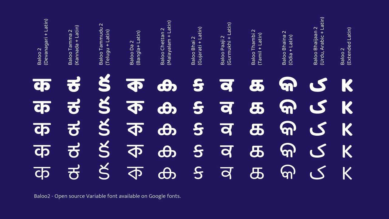
Typeface Baloo in various scripts
Ek Type’s latest typeface called Anek is another example of the work that the collective, which specialises in type designs of Indian scripts, undertakes. Co-founder Sarang Kulkarni says, “Working towards the creation of Indian script designs, we’re looking to fill the gap in existing fonts by providing technically sound design and language support so that fonts are legible, functional and aesthetically pleasing with the times, without losing the script’s visual grammar.” For this, he continues that working with language professionals, and other experts are part of the long and detailed process of font creation.
ADVERTISEMENT
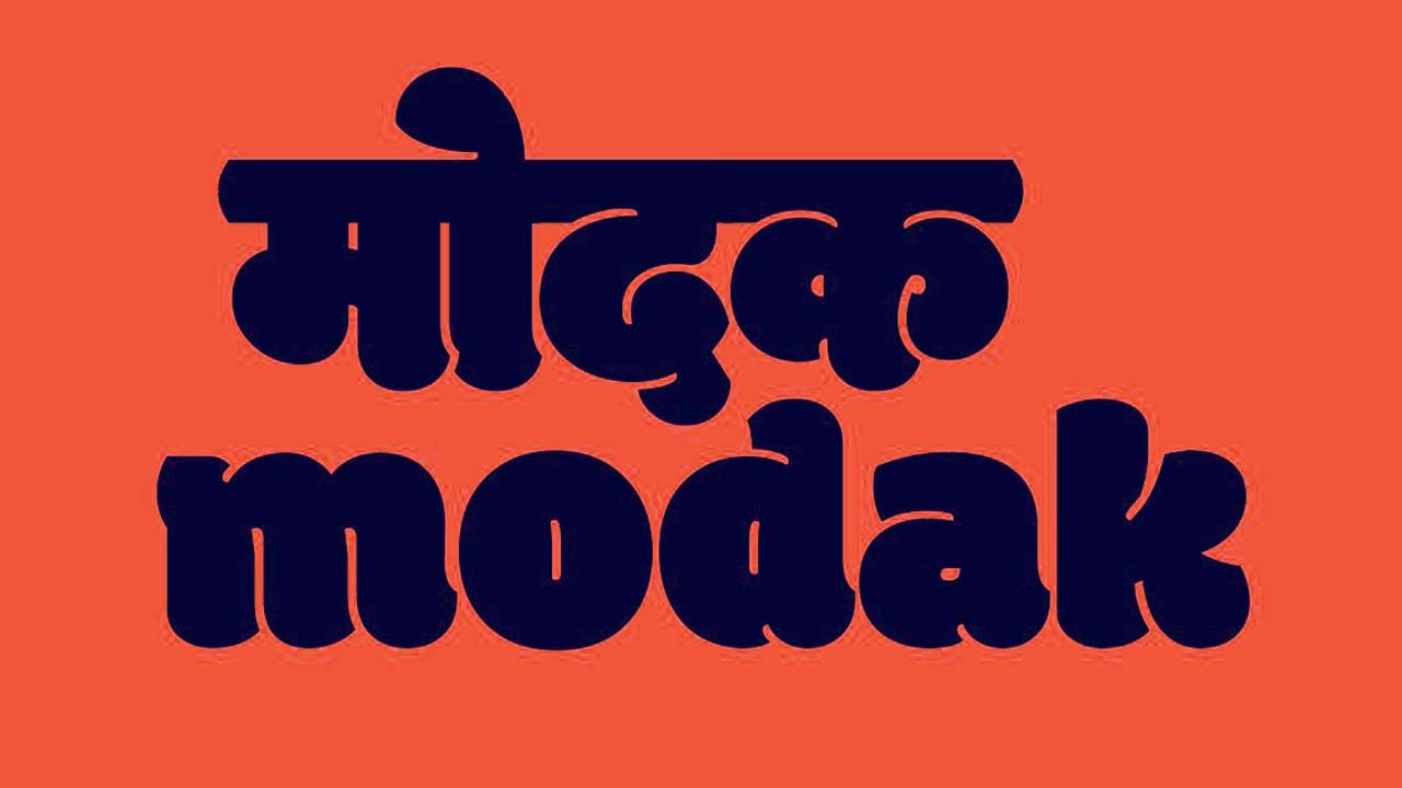
Typeface Modak
Starting each project with the objectives and outlining the requirements, Kulkarni elaborates, “Where will the font be used? What need is it fulfilling? We define these objectives to understand the visual parameters, and ensure the design caters to that sector or domain the font will be used for.”
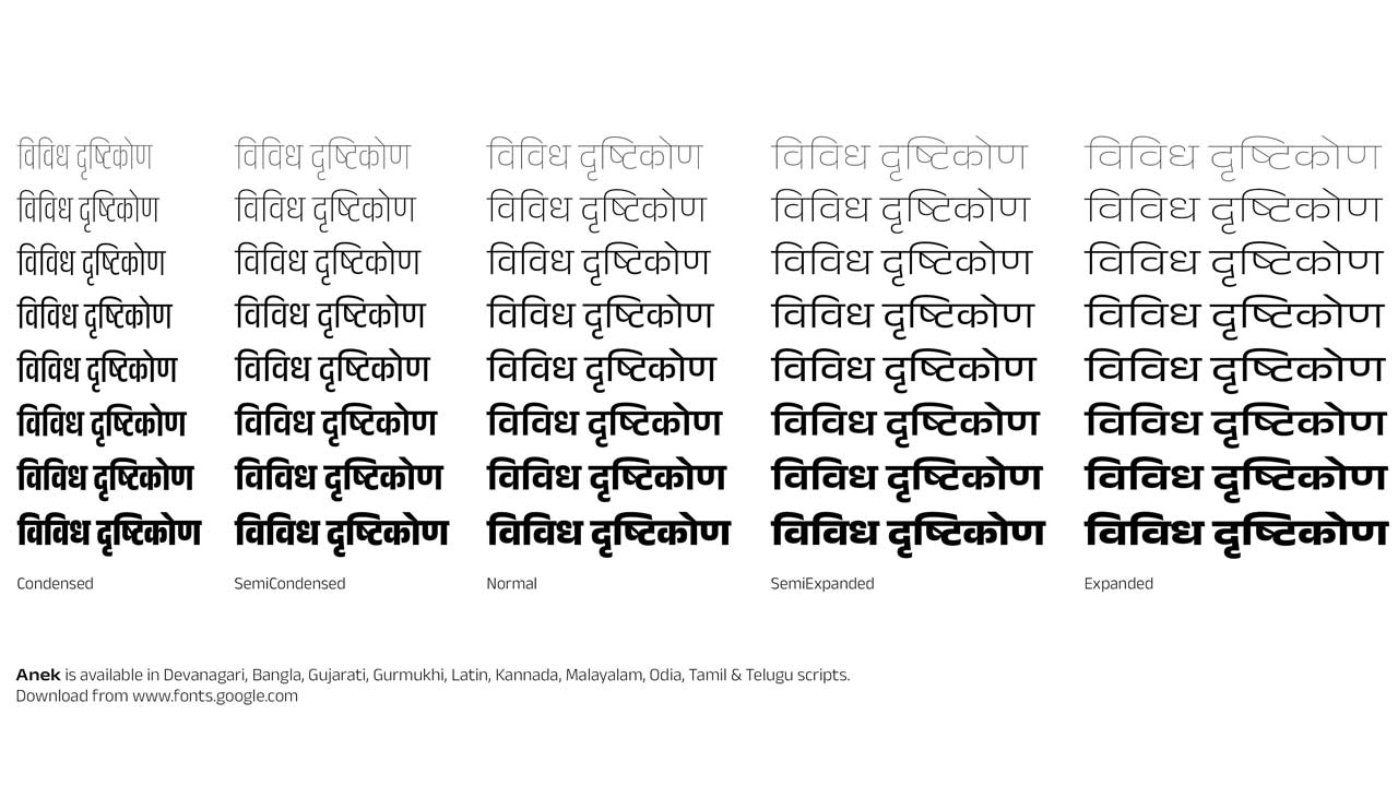
Variations in width and height of Anek. Pic Credit/Ek Type
To illustrate, the type designer shares examples of previous typefaces from Ek Type’s repertoire. Baloo, a multi-script design, was specifically created for headlines, multi-lingual branding, publications; and Modak experiments with heavy letterforms in Devanagari script while still ensuring its readability. Anek, he adds, was designed to be a versatile display typeface, mainly for large sizes and short texts. Being a variable font, it can be made narrower or wider to accommodate several words in a line.

Sarang Kulkarni
Put together in 20 months by the team at Ek Type, Anek might be one of the collective’s largest projects yet with 40 styles in 10 scripts. The font has variations of weight and width, or what one might call thinness or boldness, and narrowness or wideness of a letter. It comprises scripts such as Devanagari, Bangla, Latin, Tamil, Gurmukhi, Kannada, Telugu, Malayalam, Odia and Gujarati. A lot goes into creating a font in multiple scripts. Mumbai-based Kulkarni says, “Equal importance needs to be given to all scripts. The design of one script cannot overpower the other. They have to look like they belong to the same design family.” In a multi-script and multilingual country, Kulkarni concludes, “We work on the visual design of existing scripts. We are not creating new scripts or reviving languages, we are only doing our part to ensure that Indian scripts have contemporary and functional fonts.” Anek is available for free download on Google Fonts.
Log on to @ektype on Instagram or search for Anek on fonts.google.com
Testing it out
We invited two design experts to try out Anek; here’s their report card after they experimented with it
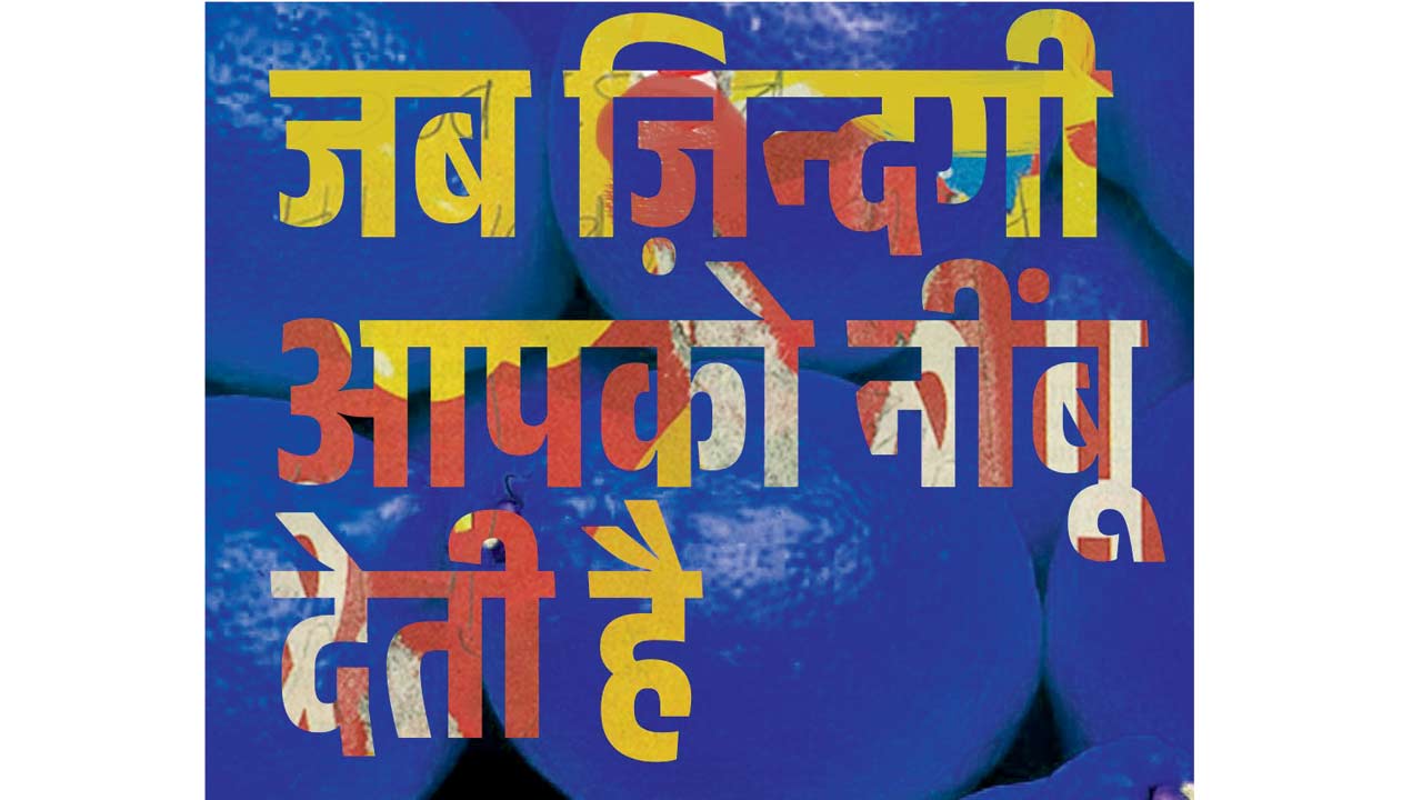
Artwork by Pratik Deo that he made using Anek
Convenient and modern
Pratik Deo, art director and illustrator, Mumbai, @pratik_deo

Anek, which means many in Devanagari, is perfectly titled because this font covers 10 scripts and various width and weight combinations — The variety of weights makes the font very convenient for multiple use cases. Anek, and other fonts by Ek Type are a much-needed addition to the Google Font library since it is sometimes a challenge to find fonts in Indian scripts with a contemporary look. This San Serif font comes with modern aesthetics and classic detailing. The equal contrast gives the font its uniformity. And, the detailed curves that form the contours beautify it, giving it a unique characteristic.
Unique and clean
Shiny Yadav, creative director and partner, Flying Cursor, Mumbai/Pune, @a_shiny_person

The font instantly ticked a lot of boxes for me; it has the 3Cs of design — clean, clear, character. It is a versatile font, but for me, the identifiable feature of Anek is the f, p & g lowercase letters, which also remind me a little bit of the classic Cooper Black, or the more serious version of that. All the characters in Anek have their own quirks, but having said that, the identifiers are missing from the type design in other scripts. Where Latin has it, the others don’t. It is a strong font choice for brand usage, as it will provide consistency across languages and mediums. It is unique enough to create recall and clean enough to be legible on small screens and sizes.
 Subscribe today by clicking the link and stay updated with the latest news!" Click here!


