A film marketing strategist and poster maven is putting together an archive of splendid movie title designs to remember a time when producers spent big bucks to say, my font is better than yours!
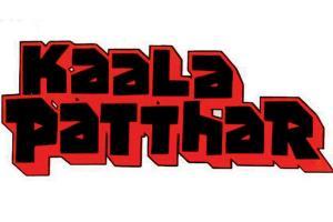
KAALA PATTHAR (1979, Dir: Yash Chopra). Design by Diwakar Karkare. "I love how the distinctive three-dimensional title design literally evokes rough-hewn rocks and the rugged terrain of a coal mine," says Bakshi
When Christian Annyas, an American website designer, realised that Hollywood has somehow managed to overlook the power of the font, he created The Movie Title Stills Collection. A very long time ago, film titles—the graphic images at the start of a movie—were simply hand-illustrated cards photographed and inserted into a film.
ADVERTISEMENT
Filmmakers would invest tons of money into this, to stand apart from all the other titles being released at the same time. From the mid-1930s through the late-1940s, the major film studios led the way in title art by employing artists like Al Hirschfeld, George Petty, William Galraith Crawford, Alvan "Hap" Hadley, and Jacques Kapralik. Over time, the artform took a backseat in marketing campaigns. Started in 2016, Annyas's website provides mind-blogging information on some of these old and popular movie title fonts.
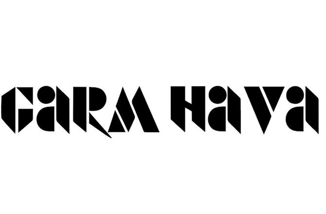
GARM HAWA (1974, Dir: MS Sathyu). Design by MS Sathyu. The sharp geometric stencils for the English title almost have a futuristic feel to it as compared to the faux stencil style that might be more indicative of the partition-era story the movie depicted
Not long after that, a similar idea came to Mumbai-based Jahan Singh Bakshi. Bakshi, who has worked on digital and creative marketing strategies for Masaan, Lipstick Under My Burkha, and Newton, is behind Posterphilia, a movie poster-centric feed curated in 2018. "After doing this [Posterphilia] for about two years, I wanted to revisit Bollywood movie title designs and dedicate an Instagram page to it," he tells us.
In June, Bakshi launched Title Recall, to document the coolest title designs and sequences from Indian cinema. "A lot of times, in old movie posters, like from Bazaar (1982, Sagar Sarhadi), I don't like all the elements, but I like the title design. There are some posters that have terrible photographs, but the handmade font style is epic. The idea is to recall these designs." Bakshi thinks the South film industry continues to support elaborate title design, evident in Jallikattu (2019) and Carbon (2018). "These title logos are released even before the first look; filmmakers pay a lot of attention to it. Unfortunately, most designs we see in Bollywood are readymade, lack detailing and are mostly unexciting."
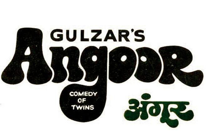
ANGOOR (1982, Dir: Gulzar). Design by Studiolink. The bulbous letters behave grape-like to express the name almost as if they're squeezing out the counter spaces. Even the Devanagari lettering matches it in its pulpy, quirky style
Bakshi has collaborated with typographer Tanya George on the project, and they hope to document title sequences too. A title sequence refers to the method by which films present their title and key production and cast members, utilising conceptual visuals and sound.

DEVI (1960, Satyajit Ray) Design by Satyajit Ray. Before Ray became a masterful filmmaker, he was already a masterful graphic designer and artist. Here, we see how the title logo of Devi beautifully resembles the frame around an idol of Goddess Durga.
What: The Title Recall project
Where: @titlerecall, Instagram
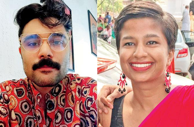
Jahan bakshi and Tanya George
Keep scrolling to read more news
Catch up on all the latest Mumbai news, crime news, current affairs, and a complete guide from food to things to do and events across Mumbai. Also download the new mid-day Android and iOS apps to get latest updates.
Mid-Day is now on Telegram. Click here to join our channel (@middayinfomedialtd) and stay updated with the latest news
 Subscribe today by clicking the link and stay updated with the latest news!" Click here!


